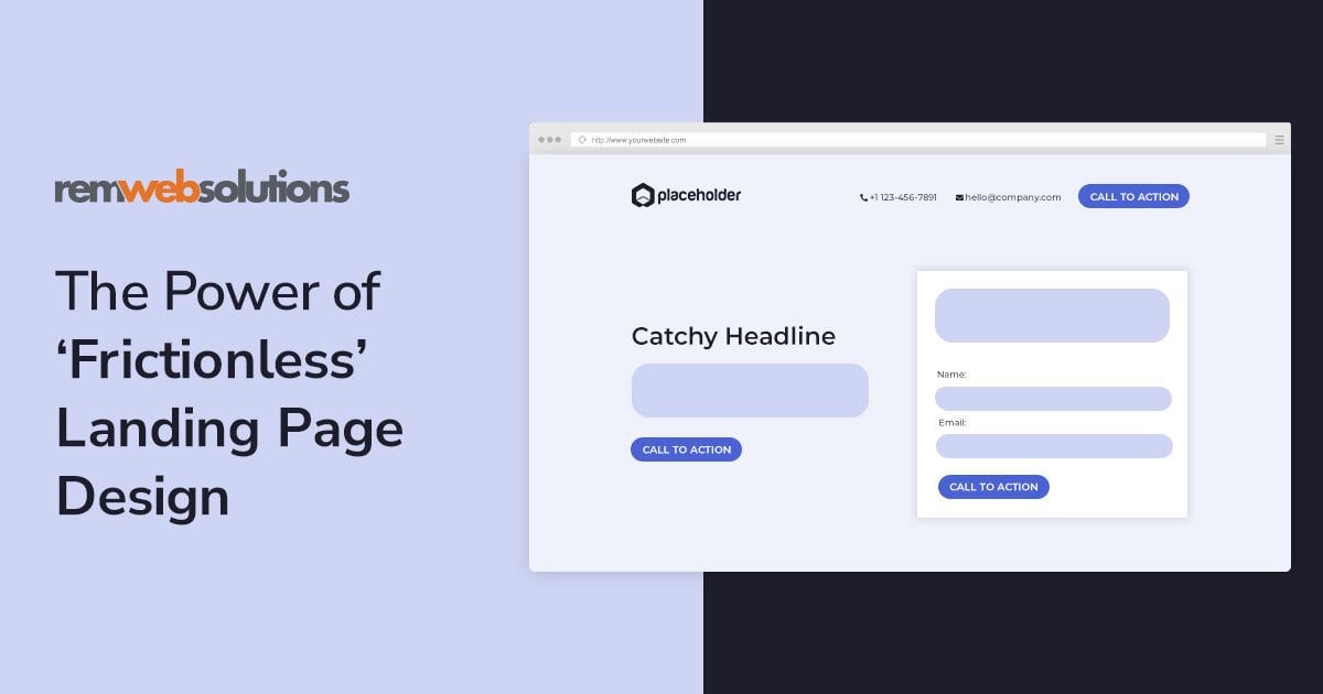
Get in touch with us today! Call us toll-free at 1.866.754.4111 or email us at [email protected] Close button
Web Design Kitchener Waterloo Guelph Cambridge AODA Development


Blog

We've written some insightful, entertaining articles that span topics from support to design to content management and beyond!


This is a headshot of Sanj Rajput.

Illustration of woman next to a browser screen with an orange button


Have you ever navigated a website, looking for a way to reach out to a company, clicking on every tab available with no luck? This interaction likely left you feeling frustrated and not confident in the company’s ability to create an easy path of communication.


Now you understand why creating effective call-to-action (CTA) buttons is an integral element in your website design and function.


Websites are powerful tools that, when well-designed, have the ability to convert casual browsers into loyal customers. But in a digital landscape that is experiencing a landslide of content, how do we do that? How do we attract someone’s attention and empower them to take an action on a website?


Simple. We draw them in with the use of a well-designed and easy to access CTA button.


Essential for any successful business website, CTA buttons serve as a powerful tool that guide visitors towards desired actions, whether it's making a purchase, subscribing to a newsletter, or signing up for a service.


In the world of web design, CTA buttons play a pivotal role in driving conversions and achieving business goals. Their strategic placement, compelling design, and persuasive copy have a direct impact on user engagement and conversion rates. In this blog post, we'll further explore their importance in web design, better understand their significance for conversion optimization, and outline key principles for designing effective CTA buttons.


What are Call-to-Action (CTA) Buttons?

CTA buttons are interactive elements on a website that prompt users to take a specific action. They are typically designed as buttons, links, or clickable graphics, and their purpose is to guide visitors towards a desired conversion or engagement goal.


CTAs can include actions like "Buy Now," "Sign Up," "Download," "Learn More," or "Contact Us." These buttons serve as clear and direct invitations for users to perform an intended action, ultimately helping businesses achieve their objectives, such as generating leads, making sales, or increasing subscriptions.


How important is website design, really? The short answer: very.

Website design plays a crucial role in maximizing the effectiveness of CTA buttons. The way CTAs are designed and integrated into the overall website layout significantly impacts user engagement and conversion rates.


Effective website design elements, such as layout, colors, typography, and visual hierarchy, can draw attention to CTAs and create a seamless user experience. Well-designed CTAs that align with the website's branding and visual style enhance user trust and credibility, making users more likely to click on them.


At the crossroads of website design and user experience

The effectiveness of call-to-action buttons on a website is closely connected to how easy the website is to use and how enjoyable the user's experience is. Website usability refers to how simple and user-friendly a website is, making sure that users can easily find and interact with the things they want. User experience (UX), on the other hand, is about the overall experience a user has while using a website, including how they feel and how satisfied they are. When it comes to call-to-action buttons, both website usability and UX are important to consider.


How to Design Effective CTA Buttons


Consider button placement

When designing CTA buttons for websites, it's important to consider where to place them. Button placement means putting them in spots where people can easily see and use them. By understanding how people look at a webpage and where their attention goes, we can put the buttons in noticeable spots. It's a good idea to place buttons near the top and on the left side of the page because that's where people usually look first. This helps grab their attention.


Button placement also helps guide people's eyes to the buttons we want them to click. We should make sure the buttons are easy to find and use, so people don't have to search or scroll too much. It's also important to place buttons where they make sense based on what the webpage is about.


Lastly, we need to consider how the buttons will work on different devices, like phones or tablets. We want to ensure they're easy to tap with a thumb and don't cause any problems.


Consider colour psychology

Button colour psychology plays a significant role in creating effective CTA buttons in web design. Colours have the power to evoke emotions, influence behaviour, and convey messages.


Different colors carry specific associations and meanings that can influence how users perceive and interact with CTAs. For example:


  • Red: Often associated with urgency, excitement, and importance, making it suitable for encouraging immediate actions like "Buy Now" or "Sign Up."

  • Green: Symbolizes growth, freshness, and harmony, commonly used for positive actions like "Go" or "Start."

  • Blue: Conveys trust, reliability, and calmness, making it suitable for actions related to trust-building or informative choices.

  • Orange: Represents enthusiasm, energy, and creativity, often used for CTAs that promote engagement or encourage exploration.


Contrast and Visibility: High contrast between the button colour and the background helps CTAs stand out and increases their visibility. It's essential to select colours that contrast well to ensure that the buttons catch users' attention and are easily distinguishable on the webpage.


Brand Consistency: Consider incorporating brand colours into the CTA design to maintain visual consistency. When users associate specific colours with a brand, using those colours in CTAs can strengthen brand recognition and reinforce the trust and familiarity users have with the brand.


Cultural Considerations: Keep in mind that colour associations can vary across cultures. It's important to research and understand the cultural meanings and interpretations of colours in your target audience's demographic and adapt your colour choices accordingly to ensure they resonate positively.


Consider button shape and size

Button size and shape are critical considerations when designing CTA buttons. Optimizing these elements is essential for ensuring clickable and creating touch-friendly interfaces, particularly on mobile devices. Here are some things to keep in mind:


  • Clickable: The primary goal of a CTA button is to encourage users to click or tap on it. To achieve this, the button should be large enough and have a size that allows users to easily interact with it. Smaller buttons may lead to accidental clicks or difficulty in accurately targeting the button, resulting in frustration and potential loss of conversions.

  • Touch-Friendly Interfaces: With the prevalence of touchscreen devices, it's crucial to consider touch-friendly design for CTA buttons. This requires buttons to be sized appropriately to accommodate touch input. A small or cramped button may lead to accidental taps or difficulty in accurately tapping the button, leading to a poor user experience.

  • Responsiveness: CTA buttons should be responsive to different screen sizes and devices. In a responsive web design, the buttons should adapt to various screen resolutions, ensuring that they remain easily clickable and accessible on different devices. This includes considering different orientations (portrait and landscape) and accommodating users with varying screen sizes, from large desktop monitors to smaller smartphone screens.

  • Shape: The shape of a CTA button can also impact how clickable and touch-friendliness. Rectangular or square-shaped buttons are commonly used due to their simplicity and familiarity. These shapes provide clear boundaries and make it easier for users to tap accurately. However, other shapes can be explored, such as rounded corners or circular buttons, depending on the design style and overall visual aesthetics.

  • Consideration of Accessibility: Button size and shape are particularly crucial for accessibility purposes. Users with motor impairments or visual impairments rely on assistive technologies or alternative input methods, such as screen readers or switch devices. Ensuring that buttons are sufficiently large and distinct helps improve accessibility, making it easier for these users to interact with CTAs and navigate through the website.


Testing CTA Buttons for Optimal Performance


A/B Testing

A/B testing is a helpful method for making CTA buttons better. Designers create different versions of CTAs with different designs or words to compare how well they work. A/B testing lets them analyze the results and make decisions based on data. It shows which design elements or words users like more and which ones lead to more people taking action. By testing different CTAs, designers can keep making them better and more effective over time.


Analyzing the data

To understand how CTAs are performing, it's important to look at click-through rates (CTR) and conversion metrics. CTR measures the percentage of users who click on a CTA compared to the total number of users who see it. It shows how interested and engaged users are with the CTA.


Conversion metrics track how many users complete a specific action, like making a purchase or filling out a form, after clicking on a CTA. By keeping a close eye on these metrics, designers can learn how effective their CTAs are and find areas to improve. Analyzing CTR and conversion data helps identify patterns, trends, and any issues that might affect how well CTAs work.


Final Thoughts

After learning more about CTA buttons and their performance abilities, you can better understand why at REM Web Solutions we’re highly passionate about designing and developing websites that are intuitive and cover all key design principles to convert individuals from casual browsers into loyal customers. Sometimes, it’s as simple as a strategically-placed CTA button to form that connection.


If you’re interested in having your website audited for CTA performance or would like assistance with designing a website that will draw your customers’ attention, reach out to us and we’d be happy to start that conversation.


Subscribe to this Blog Like on Facebook Tweet this! Share on LinkedIn
This is a headshot of Sanj Rajput.

Woman using a laptop with a piggy bank and coins next to her


In the age of technology, having a website as a small business is almost essential. Websites help you showcase products, draw in new customers, spread the word about your business and why you do it, share news about upcoming events, and it can help link people to your socials and bring them into your physical store. Websites are often seen as the heart of a company; they link everything together creating one working system or company.


However, what most people don’t consider is the hidden costs of website development. How much does it genuinely cost you as a small business to create a website? There are many factors to consider when you think about the cost of a website. What do you need out of your website? Are you making it yourself? Hiring a company? A freelance developer? Are there any additional features outside of the norm that you want to include? And most importantly, how much are you willing to spend? All of these and more can influence how much your website is going to cost.


The Most Common Expense and Features

When it comes to web design there are some basic features and expenses you will need to consider, as most if not all websites have them. The most basic of features are the ones people often forget about most. When it comes to beginning to decide what you want for your website and how big your budget is, keep these main features in mind, as they are the most important and unavoidable. Most of these are often included in a basic package price, however they can also sometimes come at an additional cost depending on what you are looking for.


Template, Themes, and Design Costs

First, when you are designing a website, you need to consider the actual design itself. Whether you are using a pre-made template from a do-it-yourself web design website or having a custom design made by a company, there are going to be costs. If you are using a pre-made template or theme, it can cost you anywhere from $0-$300, it can cost more though depending on how many pages you want. If you are going with a custom website, then it is up to the individual company and may be included in a package cost. It is all up to personal preferences and the costs may vary depending on what you want, how complicated it is, and what company you go with.


This is typically a one-off payment made when you begin the design process. However, it is good to keep in mind that updating your website’s design every few years is a good idea, as it allows you to keep up with on-going trends. This can then come with additional costs. However, because it is simply an update to the existing design the cost will be lower.


Ecommerce and Secure Payment Costs

This does not apply to every website, but if you plan on using your website to sell online, then this is an expense you need to consider. When you set up a shop on your website there are additional costs that go into making sure your website is secure and able to process payments. The last thing you want is to have your customer’s credit card information stolen because you didn’t remember to consider secure payment. Including ecommerce is also generally considered an additional cost because not every website uses it, so it may come at an additional fee, however, make sure to check when looking into different companies. Including ecommerce and secure payment features can range greatly depending on who you are going with to manage it, just make sure it is a reputable company.


Mobile-responsive Website Costs

With everyone using a variety of different devices these days, including laptops, phones, desktops, and tablets, it is highly recommended to ensure your website is responsive. This means that when you switch between devices the website adapts to the new screen size to ensure it works and continues to look nice. Most web design companies will recommend that you include this feature or automatically include it in their basic package. There is no one set fee or cost for this, it is all up to the individual company as it may require them to do more work.


Website Hosting Fees

When you create a website, the website will have what is called a Hosting platform or Hosting server. This server manages your websites files and applications, making it viewable to your customers online. Essentially it ensures that people can see your website and that the website will run correctly. When it comes to hosting platforms, every web design company has a preference of their own. If you are using a pre-made website from a company such as WIX, then they will use their own hosting platform and have control over it. If you go with a custom website from a web design company, then they may use their own or partner with a third party to host your website. However, you need to be careful. If your hosting platform is unsecure, then it can cause security breaches and potentially lead to hacking.


Domain Registration Expenses

The number one feature or expense that people forget about, is domain registration. When you choose or create your website’s domain, you will need to register it to ensure no one else is using it and pay a fee. The fee is not very high, but it will need to be renewed annually so you need to include it in your budget.


Content Management System Expenses

Content management and creation is one of the major costs with web design, as it is a continuous cost. When it comes to content creation and management, you have two options. You can either write and create all the content yourself or within your company, or you can outsource it to the company creating your website or an additional freelancer. It is all up to you, however, it is recommended to ensure that you are conducting regular management of your content. As in updating it, checking for any errors, removing old content, etc. There are also website content creation and copywrite fees to consider as well.


Additional Features and Fees

On top of the most common or unavoidable fees and expense of web design, there are also additional features that you can include depending on what you are looking for. These additional features, however, will also come at an additional cost, that however, is dependent on the company you choose to go with. These features can include:

  • Search engine optimization (SEO)

  • Website security and SSL certificates

  • Website analytics and tracking expenses

  • Integrating social media on your website

  • Website loading speed optimization

  • User experience (UX) design expenses

There are countless other features as well that you can include, it is simply all up to you and what company you go with offers.


DIY V.S. Professional Website Design

Now that you know the basic features you need to keep in mind, and maybe even some extras, you need to consider whether you are going to DIY your website or hire an outside company to do it for you. There are pros and cons to both options, but in the end it all comes down to what you think is best for your company.


Affordable Web Design Services

If you are creating your website yourself, you may decide to go with an affordable web design service, such as WIX or Squarespace. These can be great options, as they are often very affordable and easy to use. However, they lack the ability to be individual. Because you are purely working off pre-made templates and features, you lose the ability to create a unique website that stands out from the rest. You also become reliant on a very large company to fix your problems if they arise, which can be a headache.


The other problem is the site will be proprietary and you will most likely have to abandon the site if the company ceases operations or if you want to change designers. However, it may be what works best for you.


Choosing the Right Website Design Agency

If you decide to go with a custom website, you can go through a freelancer or specialized company, such as REM. Custom websites can be a lot more money and can often take more time as you will need to be in contact with the company, giving feedback and providing them with important information to include. However, they are a lot more customizable. You can have whatever design you want. Include as many or as little features as you want. And if something goes wrong or you need help, they are there to help you, quickly and easily.


Most companies generally also allow you to continue updating and managing your content through them for a yearly or monthly fee. This can also make the process easier. Not everyone is versed in how to make a website, nor do they have someone within their company to do it for them. By hiring outside, professional help, you are ensuring that your website will look good, work, and be optimized for the customer experience.


We hope this was helpful for you when considering what you want out of your small business website. For more website and small business content, check out the rest of our blog page.


If you are interested in creating a custom website, call us, email us, or come into our office today and we can get you started.


Subscribe to this Blog Like on Facebook Tweet this! Share on LinkedIn
This is a headshot of Sanj Rajput.

Man holding a lightbulb with the word SEO and graphics around it


What is Local SEO?

Local SEO (Search Engine Optimization) refers to the practice of optimizing a website to increase traffic, visibility, and brand awareness from local searches. Local searches could include certain geographical keywords or phrases, such as the name of a city or a neighborhood. For example, "best coffee shop in Brooklyn" or "plumbers near me".


Local SEO (Search Engine Optimization) is a subset of the broader SEO practices focused on improving a website's visibility in overall search results. Local SEO is particularly crucial for businesses that operate in specific geographical locations or serve customers in a specific area.


The search engines can tell when queries and content are local to the user who is making the search. Search engines like Google are sophisticated enough to understand when a user is performing a search with local intent, even if it's not explicitly stated in the search query.


For example, if someone searches for "coffee shop," Google will likely show results of coffee shops in the user's area, despite the query not specifying a location. This is because Google infers that the user is probably looking for a coffee shop nearby based on the nature of the search.


Furthermore, Google will also scan your website's content to understand if it's relevant to local search queries. So, if your website clearly indicates that you operate in a particular area, Google is more likely to show your website for searches relevant to that area.


By optimizing your website for local search, you make it easier for Google to understand where your business is located and what areas you serve. As a result, Google can better match your website with relevant local search queries, increasing your visibility among local customers.

Before we jump into the criteria for optimising your website for local SEO, let’s take a quick look at why local SEO is important for your website.


Why is Local SEO Important for Small Business?

Optimization of local SEO can help your small business maximize its marketing efforts, improve your visibility, drive more traffic, and ultimately increase your sales. This makes local SEO a crucial aspect of digital marketing for any business with a physical location or a local service area. Here are some of the key benefits:


Increased Visibility

Local SEO helps to boost your visibility in the local area. When your business shows up in local search results, you have more opportunities to reach potential customers and clients who are in the vicinity of your business.


Location-Based Searches

The advent of mobile technology has changed the way people search. More people are searching "on the go" using their mobile devices, and Google takes location into account. Even if a location qualifier isn't used in a search query, Google might still serve local results that are relevant.


Increased Traffic and Sales

Effective local SEO can help to drive more traffic to both your website and your physical location. People searching locally are typically looking to find an immediate solution, which often translates to an in-store visit. According to Google, 76% of people who conduct a local search on their smartphone visit a physical place within 24 hours and 28% of those searches result in a purchase.


Beat the Competition

Many small businesses have not yet recognized the importance of local SEO, so it's a chance to get ahead. If your business shows up in Google's local three-pack or in top local search results, you have a competitive edge over your rivals.


Google My Business

One of the key tools for managing your local SEO is Google My Business. By optimizing your Google My Business listing, you can improve your chances of showing up in Google's Local Pack, Local Finder, Google Maps, and organic rankings in general.


Cost-Effective

Unlike paid advertising, local SEO is organic, making it cost-effective. The only cost is the time and effort it takes to optimize your online presence.


Online Reviews

Online reviews are a big part of local SEO. The quantity and quality of your business reviews on Google is one of the most important ranking factors for local SEO.


Businesses with numerous high-quality reviews often rank higher in local search results. These reviews also enhance a business's trustworthiness and authority from a user's perspective, improving the click-through rate and indirectly boosting rankings.


Additionally, reviews provide fresh user-generated content, often incorporating relevant keywords and local references that enhance local SEO efforts. Specifically, reviews on a business's Google My Business page can help the business appear in the prominent "local pack" of search results.


Lastly, positive reviews can boost conversion rates, indirectly benefiting overall SEO by attracting more site visits and potentially generating additional reviews.


Now that you know what local SEO is and how it benefits your business, let’s review the criteria for how you should determine if your company needs local SEO.


How do I Know if My Business Needs Local SEO?

There are four main criteria you should consider before investing in local SEO for your business:


1. Physical Location

Your business has a physical location where it serves customers, or you go to clients in a specified service area. This can include businesses like restaurants, retail stores, law firms, medical practices, and more. Even if you serve a larger area, optimizing for the city where your office is located can help build brand awareness locally.


2. You Depend on Local Customers

If a significant portion of your customer base is from a particular locality, city, or region, then local SEO can help increase your visibility among this target audience.


3. You Have Local Competition

If you're vying for customers with other similar businesses in your local area, local SEO can help give you a competitive edge and ensure your business shows up in local search results.


4. Your Business Serves Multiple Locations

If your business has multiple locations or serves multiple areas, you'll want to optimize for each of those locations to reach as many potential customers as possible.


Does your business meet one or more of the above criteria? If so, you should speak to your marketing team to make sure they are optimising for local SEO. If you don’t have someone working on your digital marketing, reach out to our digital marketing team here at REM and we can help!


Before we finish, and you speak with us about getting local SEO started for your business, let’s look at how Google (and other search engines) determines if you are local or not?


How does a Search Engine Determine if you are Local?

For a search engine to consider a business as local, it examines the information available about your business online, such as:


NAP Consistency

NAP stands for Name, Address, and Phone number. Search engines like Google use this information to determine where your business is located. It's crucial that your NAP information is consistent across all platforms and listings.


Google My Business Listing

Your Google My Business listing is a key factor in your local SEO. This listing provides Google with information about your business, including your address, service area, business category, and more.


Local Keywords

If your website content includes location-specific keywords (such as the name of your city or neighborhood), search engines can use these clues to understand where your business is located.


Local Links and Citations

Links to your website from other local businesses, or mentions of your business on local websites, can help signal to search engines that your business is part of a specific local community.


Customer Reviews

Reviews on Google, Yelp, and other platforms not only provide user-generated content with potential local keywords, but also signal to search engines that your business is operational and serving customers in the location.


Social Media Signals

Information and engagement on your social media profiles can also provide search engines with information about your location and the area you serve.


Keep in mind that any business with a physical location or that serves a specific geographic area can benefit from local SEO. It's all about making sure you're visible and attractive to your potential customers who are searching for your product or services locally.


In Conclusion

Local SEO is a fundamental strategy for any business with a physical location or servicing a particular geographic area. It aims to optimize your online presence to attract more business from relevant local searches on Google and other search engines.


By optimizing your website and Google My Business listing, incorporating location-specific keywords, securing local links and citations, and fostering a robust collection of online reviews, you can increase your business's visibility, traffic, and sales from customers in your area.

More than just boosting your rankings in search results, local SEO builds your business's credibility and authority, setting you apart in a competitive market. With the significant role of mobile technology, Local SEO has become even more critical, as more people are conducting location-based searches "on the go."


While local SEO is cost-effective, it does require a dedicated effort. If your business meets the criteria for needing local SEO and you're ready to reap its benefits, it's advisable to engage with an expert digital marketing team, like the one at REM Web Solutions. With professional help, you can efficiently navigate the nuances of local SEO and unlock its full potential for your business's success.


Subscribe to this Blog Like on Facebook Tweet this! Share on LinkedIn
This is a headshot of Sanj Rajput.

Designer creating wireframes and planning a website design


In our fast-paced digital world, web design and usability play a crucial role in creating extraordinary user experiences. A beautifully designed website goes beyond grabbing attention; it captivates visitors, guides them seamlessly, and leaves a lasting impact.


Whether it's a personal blog, online store, or business website, embracing the best practices of web design and usability is essential for creating amazing user experiences.


Web design combines style and functionality to craft an interface that is visually appealing and intuitive. While usability focuses on making the website user-friendly and easy to navigate, ensuring users can find what they need effortlessly. By finding a balance of both of these elements you can create a well-structured website that enhances user experience and encourages return visits and positive word-of-mouth of your brand.


Follow these best practices to see the benefits for yourself; such as higher conversion rates, a stronger brand image, and the achievement of your website's goals!


Fundamental Principles and Guidelines for Effective Web Design

When it comes to creating exceptional web design, there are fundamental principles and guidelines that serve as the backbone of a successful website. Follow these steps to get started:


1.Define Your Purpose

First and foremost, purpose and clarity are paramount. Clearly defining the purpose of your website and communicating it effectively to users is crucial for engaging their attention and guiding their actions.


2.Think About Your Audience

A user-centric approach is equally important, as understanding your target audience's needs and preferences allows you to design with their goals and expectations in mind.


3.Keep it Simple

Embracing simplicity and minimalism in your design not only enhances the visual appeal but also ensures that users can navigate your website effortlessly, without feeling overwhelmed.


To create exceptional web design, remember to define your purpose clearly, understand your audience, and embrace simplicity throughout your website.


The Importance of Cohesive Design in Branding

Consistency is a very important aspect of a successful brand. A visually appealing and cohesive design is essential for capturing and retaining users' interest, establishing credibility, and showcasing professionalism. It instills trust and confidence in your brand or content, leaving a lasting impression on visitors.


Consistency in branding elements throughout the website, such as colour palette, typography, logo, and visual style, is crucial for creating a cohesive and memorable user experience. It fosters trust, professionalism, and brand recognition, enabling users to easily recognize and connect with your brand.


Your website's design acts as a powerful tool in conveying your brand's essence, establishing a distinct identity, and shaping users' perceptions and engagement.


Colour and Typography in Web Design

The choices you make regarding colour and typography in web design can have a significant impact on the overall user experience.


Colours evoke emotions and set the tone for your website. Selecting a colour scheme that aligns with your brand identity and resonates with your target audience is crucial. Consider the psychology of colours and how they can influence user perception and behaviour.


Typography, on the other hand, affects readability and the visual appeal of your content. Choose fonts that are legible and appropriate for your brand image.


Carefully choosing colours and typography in web design can greatly influence the user experience, evoking emotions, setting the tone, and enhancing readability and visual appeal.


User-Centric Web Design

While the overall look and appearance of your website are important, you also need to think about how your audience will navigate through your website. By prioritizing the needs and preferences of your users, you can create an experience that resonates with them and guides them seamlessly through your website.


Intuitive Navigation

Intuitive navigation ensures that users can find what they're looking for quickly and effortlessly, reducing frustration and increasing engagement. A well-structured and organized website enhances usability, encouraging visitors to explore further and delve into your valuable content.


To achieve this, it's essential to employ user-centric design approaches. Understanding user behaviour and preferences is key to tailoring your design effectively. Techniques such as conducting usability testing allow you to observe and gather feedback from users interacting with your website.


This valuable process helps identify pain points, uncover usability issues, and make informed design decisions based on real user insights. By understanding how users interact with your website, you can make adjustments to create a more intuitive and user-friendly experience.


Incorporating a Visual Hierarchy

The effective use of visual hierarchy is essential for guiding users through your website. By strategically arranging content elements using size, colour, contrast, and positioning, you can create a visual hierarchy that leads users through the page and highlights important information. This helps users easily navigate your website, find the content they're seeking, and engage with your website more effectively.


Call-to-Action Elements

The proper placement and design of call-to-action (CTA) elements play a significant role in guiding users toward desired actions. CTAs should stand out visually, using compelling copy and design to encourage users to take the desired action, whether it's making a purchase, signing up for a newsletter, or exploring further. By strategically placing and designing CTAs, you can drive conversions and achieve your website's goals.


By implementing user-centric design approaches, intuitive navigation, visual hierarchy, and effective CTAs, you can create a seamless and engaging website that prioritizes user needs, allowing visitors to effortlessly navigate, find information, and engage with your content effectively.


How to Improve the Usability of Your Website

Now that we’ve thought about how the user will navigate through our website, it’s important to further explore ways to improve usability on a larger scale. Improving website usability is a crucial aspect of creating exceptional user experiences. To enhance usability, it's essential to focus on a couple of key areas.


1.Basic Usability

First and foremost, ensure that your website content is clear, concise, and easily digestible. Users appreciate straightforward information that is presented in a way that is easy to understand. Avoid jargon and excessive technical language, and use headings, subheadings, and bullet points to break down content into scannable chunks.


Additionally, pay close attention to the usability of your forms. Make sure they are easy to use and require minimal effort from users. Simplify form fields and only ask for essential information, reducing friction and increasing the likelihood of form completion.


Implement helpful error handling by providing clear error messages and suggestions for correction. This way, users can easily identify and resolve any issues they encounter.


2.Responsive Design and Mobile Optimization

With the prevalence of smartphones and tablets, it's crucial to ensure that your website provides an optimal experience across all devices and screen sizes.


Responsive design allows your site to adapt seamlessly, delivering a consistent and user-friendly experience regardless of the device being used.


Mobile optimization goes beyond responsiveness and involves optimizing loading speed, simplifying navigation, and prioritizing essential content for smaller screens.


Now that we've covered the fundamentals of usability and responsive design, let's dive into a helpful checklist to get you started reviewing your website.


Web Design Usability Checklist

  • Optimize page load speed to ensure a seamless user experience.
  • Implement responsive design for consistent usability across different devices.
  • Compress images, minify code, and use caching techniques to improve performance.
  • Embrace inclusive design and follow accessibility guidelines for a website that accommodates all users.
  • Provide alternative text for images and prioritize proper heading structures.
  • Simplify navigation and prioritize essential content for mobile optimization.
  • Create an efficient and user-friendly form by reducing fields and providing clear error handling.
  • Use clear and concise content to enhance readability and understanding.
  • Break down content using headings, subheadings, and bullet points for easy scanning.
  • Prioritize user-centric design and consider the needs and preferences of your target audience.


By implementing key strategies such as clear content presentation, user-friendly forms, responsive design, and mobile optimization, you can greatly enhance the usability of your website and provide exceptional user experiences for a wide range of users.


Having implemented all the necessary steps thus far, you are now prepared to effectively connect with your target audience and align your brand with their needs. Let's delve into the strategies for optimizing your site and successfully reaching your intended audience.


SEO and Web Design Synergy

The relationship between SEO and web design goes hand in hand when it comes to creating an exceptional online presence. Web design elements play a significant role in optimizing your website for search engines, ensuring that your valuable content reaches your target audience effectively.


By optimizing web design elements such as responsiveness, mobile-friendliness, loading speed, and strategic use of heading tags and keywords, you can improve your website's visibility and accessibility to search engines.


Effective use of heading tags, meta descriptions, and relevant keywords within your web design elements can enhance your website's visibility in search engine results. By incorporating these elements strategically and naturally, you provide search engines with valuable information about your content, making it easier for them to index and rank your website appropriately.


Synergizing SEO and web design best practices, you create a website that not only looks visually appealing but is also optimized for search engines. This ensures that your valuable content reaches your target audience effectively, driving organic traffic to your website.


Web Design Trends and Maintaining Usability

Staying informed about current web design trends and best practices is essential for creating exceptional user experiences. While new trends offer innovative ways to engage users, it is crucial to prioritize usability. By striking a balance between incorporating trends and ensuring usability, you can create a visually appealing and intuitive user experience.


Evaluating trends through the lens of usability allows you to enhance aesthetics and functionality. Combining current trends with timeless usability principles enables the creation of a visually stunning and user-friendly website that provides an exceptional experience for visitors.


At REM, we understand the significance of following best practices in web design. By incorporating purposeful and user-centric design, we create websites that capture attention and seamlessly guide users, resulting in increased satisfaction.


Our expertise in intuitive navigation helps us build well-structured websites that reduce frustration and improve engagement. We prioritize visual hierarchy, carefully arrange content elements, and maintain a cohesive design that aligns with brand identity and fosters positive brand perception.


Our team stays updated with the latest design trends while prioritizing usability, enabling us to create visually stunning and user-friendly websites. Through these practices, we have helped numerous clients achieve their website goals, increase conversion rates, and elevate their online presence.


Partner with REM to explore the world of effective web design, where aesthetics and functionality converge, and together, we can create exceptional user experiences that drive success!


Subscribe to this Blog Like on Facebook Tweet this! Share on LinkedIn
This is a headshot of Sanj Rajput.

Purple and teal illustration of computer screen with web elements around it


One of the most important things for any business is their website. It draws in new customers and gives visitors the basic information they need to do business with your company. However, it is still surprising how many small businesses don’t have a website. There is so much that goes into creating a small business that the website often gets overlooked. Your website can be one of the most important assets to getting your small business off the ground.


Ensuring that you have a good looking, easy to navigate, and informative website can give you the leg up you need in the business world. Here at REM, we pride ourselves on creating great websites that will reflect your great business.


Here are our top 12 most important features all small business websites should include:


1. An Excellent Domain Name

Before you even begin to design the website itself, you need to come up with a good domain name. This is the first thing any potential customers will see when clicking on your website. So, it is very important that your domain name is good.


First, it should be easy to spell. The last thing you need is for someone to give up going to your website because the address is too difficult to spell. Make it something simple and intuitive. If possible, you should try to include some keywords in your domain if they are easy to spell as well.


Second, it should reflect your company. Don’t make it something entirely unrelated to your business. Start with your business name if that domain is already taken then try modifying it. For example, your business may be called “Dog Beds” however, “DogBeds.com” may already be taken. So next try “Dog-Beds.com”. Any small change can work, just as long as it is still a reflection of your company.


2. Informative “About Us” Page

You should always include an “About Us” page. It may seem redundant at this point as most websites include them, but they do that for good reason. It gives any potential customers vital information about who you are as a business and what you stand for.


It should include basic information such as the owner of the business, when and why the business was started, what the company’s motivations are, and your current mission or progression track. This will give your customers a good sense of who you are and can influence them more to buy from you.


At REM we believe in creating an About Us page that rewards your visitor for reading it. If someone cares enough about your company to want to learn more about it, you should give them an amazing About Us page.


3. Easy to Find Contact Information

Contact information may seem obvious to most people; however, it also needs to be easy find. It can be one thing to include your contact information, but it’s also just as important to make sure it is located on several areas of your website. People have short attention spans and don’t like to spend a lot of time looking for things such as contact information. Placing it in an easy to locate spot can be very useful.


The best places to put it are typically at the end of every page or on its own separate page that is clearly labeled. It should also include all your information such as, phone number (with extension if necessary), email address, office hours, link to all social media pages, location with map if possible, and finally a contact form they can fill out with all important information if they are unable to get in contact now.


REM has a great guide on “How to Write a Great Contact Us page." This guide will help you create a page that converts visitors into clients. Contact us if you would like a copy!


4. Products or Services Page

Including a product and services page allows your customers to get a look at what they will be paying for. This doesn’t have to be big or include all your products, just a good and simple overview so people know what you sell. This can also be a way to include an online buying feature. People like to know what they are buying especially if it means they don’t have to leave their homes to find out. Including it on your website can drive in more customers, even if you don’t sell online.


5. Customer Testimonials

Consider including customer testimonials or reviews. When people are visiting your website, it can be comforting to see customer reviews right on the website itself. First, this shows them that people genuinely like your products and will entice them to buy from you. Secondly, it shows potential customers that you’re an open and transparent company that is not afraid to hide what people have to say about you. This will continue to instill confidence in your customers.


6. Call to Action

Include a call to action right on your home page. A call to action is a simple way of drawing people in to make a purchase or check you out in person. It doesn’t have to be anything big or flashy, in fact the more sublet the better. This way people don’t know you’re the ones getting them to buy.


Putting it on your home page as well is a great idea as it is going to be one of the first things people see. However, feel free to put wherever you want. It should be something like, “come check us out in store today!” or “for more information feel free to give us a call or come visit us in person and we will happily answer any questions.”


7. Good Search Engine Optimization

One of the most important parts of having a website is making sure people can find it, because if they can’t then what’s the point in having one? Make sure you have good search engine optimization (SEO), this will ensure people can easily find your website.


SEO can include everything from making sure you have the right key words present in your content, properly and appropriately labeled pages, headings and subheadings for your content, and a good domain name. These all affect your SEO and how your website presents in search engines such as Google.


The last thing you want is for your website to show up on the third or fourth page when your products are searched. REM has an amazing monthly SEO service as part of our Digital Marketing offerings. Reach out to your REM representative today to get more information about getting your website noticed online.


8. Secure Hosting Platform

Making sure your website is up and running constantly can seem like a daunting yet important task. However, it can be very easy if you make sure you have a secure hosting platform. This can often be overlooked as most think any old hosting platform will do.


However, it can be the most important part of having a website. The last thing you need if your website to suddenly crash or crash constantly, or even get hacked. So, make sure to invest the time and money into making sure you have a secure hosting platform.


All REM clients are hosted on our own secured servers in a local data centre. We keep all of our data on Canadian soil, with redundancies and back-up servers ready-to-go in case of a problem.


9. Good Device Scaling

In the current age of the Internet people have become very impatient, especially when it comes to websites. If I am looking at a webpage on my computer but want to switch to looking at it on my phone for ease of transport but it doesn’t work, I am just going to give up and look at a different website. This is true for most other people as well.


However, this can be avoided if your website is responsive. This means that your website looks good and functions no matter what type of device or browser people are using. Whether it be a laptop, desktop, phone, tablet, projector, Google, Firefox, or even Bing it should work smoothly on all of them.


10. Up to Date Content

Once people are actually on your website, they are going to want to look at your content, blogs, promotions, your home page, upcoming events, etc. All this information needs to be up to date and relevant. What you don’t want is for someone to visit your website in June and you’re still advertising your Christmas promotions from last year. You want to make sure they are seeing your latest deals, reading your latest news, and visiting your website constantly to see what’s new.


11. Photos and Videos

Photos and videos may seem obvious as most people tend to be very visual, we like to see what we are buying. However, photos and videos can go beyond just your products and services. Include photos of your company volunteering for charities you support or show the outside of your building so it is easy to find, or even employee photos so people know who they will be dealing with at the company.


It can also be nice to include videos of your products being used, or an office tour, or even your employees or the owner talking about the company and its journey. This can all help sell your company and its products.


12. Design and Style Easy to Scan

Finally, you should make sure that you not only have a nice good-looking and professional design and style for your website, but also one that is easy to scan. People these days get bored very easily, so they tend to scan websites for the information they need. If they can find it, then they will slow down and keep reading more. If they don’t, they tend to leave and try to find a different website. Include things like headers, highlight important information, bullet points, and all-important information in standout places like a banner or on the home page.


We hope these tips were helpful for you in creating an amazing website for your small business. For more website and small business content check out the rest of our blog page. If you’re interested in a new website, give us a call, email, or come into the office and we can get started.


Subscribe to this Blog Like on Facebook Tweet this! Share on LinkedIn
This is a headshot of Sanj Rajput.

Illustration of colourful website page with assorted elements around it


Trends and designs are forever changing. Every year, companies that feature designs release new and upcoming trends for the year to help influence potential customers and other designers. This past year and this coming year we have seen a spike in the number of trends being released as there is a more diverse pool to pick from.


Everything from Y2K fashion all the way to Scandinavian designs have been trending this past year. These trends have been appearing in interior design, fashion, jewelry, company branding, and even web design. This summer consider integrating some of these new trendy designs to make your website stand out more.


Here is our list of the top summer web design trends for 2023.


Top Styles

When it comes to designing a website, you want to have a certain style, almost like fashion or art. It should look nice, represent some of the latest trends, but also reflect you as a business owner and company. With the current state of the internet, everyone has their own personal style and design preferences, making way for a wide variety of popular trends in design. Because of this business owners can now update or design their websites with these upcoming trends in mind, while still staying true to their company.


The current design trends vary from minimal and sleek, to colourful and maximalist. You can find almost anything that suits your personal style and remains on trend.


Y2K 90’s-00’s

That’s right, the 90’s are back, and they are taking over the world of design. Right now, the Y2K and 90’s styles have come back as Gen Z has created a new space for their popularity. Everything from fashion to web design has been brought back to the turn of the century.


Because of this, you can expect to see things such as pixel designs, oversized cursors, pastel colours, big and bold patterns, etc. Almost anything that was popular in the 90’s has been resurrected today and can be seen reflected in every element of design.


Vaporwave, Cyber, and Multi Verse

Anyone who grew up in the 80’s will remember the vaporwave and cyber aesthetic. Dark and bold colours like blues and purples. Big graphics that filled a page. And the idea of being part of an online universe. Consider including elements such as those dark colours, glitch effects, over-laid graphics, geometric shapes, chat bots, and even some AI-powered design.


Gamification

Gamification may be new for a lot of people; however, it has become quite popular lately. It is the idea of integrating design and software elements of video games. Have your website not only look and feel like a video game but have some features of one too. Such as having goals people can meet on your website with a progress bar they can see. Or other interactable elements that sell the idea of participation and collaboration.


Maximalism

Maximalism is obvious, just add as much as you want or can. It typically is associated with brighter colours, bigger shapes, and more harsh lines. Include bright colours, big geometric shapes, bold typography, large photos, and multilayered designs. Adding other interactable elements can also add to the idea of “too much”, which in this case is good.


Minimalism

Minimalism on the other hand is a much softer approach. It typically features softer colour palettes, soft shapes, and more movement to its lines. Include soft colours like beige or pastels, organic shapes (perhaps with movement animations), simple typography, smaller fonts, soft shadows, colour gradients, and more simplistic photos. The idea here is to have clean lines and optimize your given space without over filling it.


Vintage

Vintage aesthetics have taken over again, however, this time it is not one true vintage style. It is more of a mix from different decades that people feel represent the “vintage aesthetic”. This typically includes muted colours, calligraphy type fonts, layered elements, hand drawn or painted illustrations, and little to no photos or videos. Consider extra elements such as stamps or labels, hand illustrated elements, less animation, style of a vintage ad or newspaper, or even grain overlays like film grain.


Illustrations

New styles aren’t just making their way into the latest trends, new illustration styles are also breaking through. People these days are very visual, so when visiting a website, they want more to look at than just words. They want photos and videos and little illustrations they can look at or interact with. Adding illustrations can also give your website more of a fun and friendly appearance, rather than looking overly professional or boring.


Custom Typefaces

Custom typefaces are less of an illustration element but can still add that stand out and add a handmade touch. Everyone these days is bored of the typical fonts you can find on the internet and are instead turning to creating their own custom ones.


On top of that a big trend for this year is handwriting fonts, a font made to be your exact handwriting. This can add a more realistic feel to your website and make people feel less like they are reading a generic website and more like they are interacting with a person. As well as add more to your overall brand.


Just be careful using a cursive font as young visitors may not be able to read the site since cursive writing is no longer taught in schools.


3D Illustrations and Animations

3D images and animations have become very popular over the past few years and are beginning to make their way into the world of web design. Including things like hand drawn 3D images can make your website stand out from others. Adding in 3D animations as well can help sell the idea that we are moving into the future and give your customers something to interact with or view while on your website.


Clay Morphism

Clay morphism is a more specific example of 3D illustrations. It is a particular type of illustration that is meant to look like clay figures, like Claymation movies. Think of movies like “Coraline”, the way you can tell it is made of all clay. However, instead of trying to make them more realistic, clay morphism embraces the clay look and instead goes for more organic shapes and a cartoon look.


Full Page

Full page illustrations are a great way to get people’s attention. For one it is going to be the first thing they see when visiting your website. Secondly, it can often be a great way to sell people about your company or products. Feature a big illustration right on your home page or your logo, top product, company mascot, or simply anything that has to do with your company can be a great way to draw them in.


Animations

Animations are another great element to include as they sell the feeling of the website being alive and in motion. Not to mention it can be a great way to throw in something like a “sale” button or a mini demonstration of your product. Animations are overall a great way to get and keep people’s attention.


Multi Layered

Multi layered refers to the style of having one or more illustrations or images layered on top of and behind text, typically on your home page. These images can often change or disappear when the user scrolls, making it easier to read the over laid text. These images can also be over laid with graphics, illustrations, or blocks of colour to make text more visible.


Branded

Branded illustrations are a new thing we are beginning to see pop up this year. They are often hand drawn images reflecting brands that your company works with, supports, is sponsored by, or simply your company itself. It can be a great way to show off your company or others you associate with, without having a wall of logos. This can be a more creative way of doing this, that way people see it more as art and less as forced branded content.


Interactions

On top of things like animations and large hero images that draw in people’s attention, interactions can also be great. Interactions allow you to keep people focused on your website while also allowing them to have fun and customize their experience with it.


“Just for fun”

Aside from interactions that have a purpose on your website, like “click here for sales”, there are also “just for fun” interactions. These can be almost anything you want because they are “just for fun” and are meant to simply get your customers to engage with the site and not necessarily do anything else. They can be something simple like clicking an envelope and a bunny pops out for Easter, or something more complicated like clicking on a robot and it “destroys” the home page.


Product Displays

Interactable product displays have become very popular for summer 2023 as they allow people to not only see what they can buy, but also interact with it. It can be something simple like having to “flip” through a booklet of your products by clicking on the pages. Or something more complicated. It is all up to you, just don’t make it too difficult for people to figure out.


We hope this blog was helpful in guiding you towards the latest trends for summer 2023. For more website related content, check out the rest of our blog page.


Subscribe to this Blog Like on Facebook Tweet this! Share on LinkedIn
This is a headshot of Sanj Rajput.

Illustration of a laptop with a cog, loading screen, envelope and chat bubble


Having a website for your business is a great way to sell online, create brand awareness, draw in new customers, update existing customers, and develop a platform for your business. However, none of these matters if your website is not optimized to gain the most out of your incoming traffic. If people are unable to find pages on your website or it is simply not showing up on Google because you have bad search engine optimization (SEO), then what is the point in having a website.


Well, the good news is that most of the mistakes that people make when it comes to making a website are easily fixable. It is easy to make common mistakes especially if you are an inexperienced web designer. However, they are easy to fix if you know how and where you went wrong.


These are the top 5 most common website mistakes and how to fix them.


Outdated Content

The number one most common website mistake people make is having outdated content. Now there is always going to be certain content on your website that will never need to be changed, such as basic information on your home page, the “about us” page, or your contact information. The rest of your website should be getting regular updates.


If you sell products online or simply feature a products page, then it should be regularly updated as your products change. If you post promotions on your website, you don’t want someone to visit in April and still see Christmas sales promotions.


How to fix it

Making sure your content is up to date is an easy fix. Simply make sure you are having regular reviews of it. Whether it be weekly, monthly, or bi-monthly it should be reviewed regularly on a schedule. Reviewing it once a year or once every six months is not enough. It should be at least bi-monthly and on a consistent schedule.


On top of that make sure to talk to every department about the website, what new products, promotions, or information needs to be added. This needs to be done for everything on the website every time you review it, that way you are covering everything and won’t miss anything that needs to be updated.


Mobile Responsiveness

With the invention of having the internet in your pocket, less and less people are using their computers to surf the web, instead they have switched over to their phones. Because we can so easily access the internet from our phones now, most of our online searches are conducted from it. So, what happens when a website is unable to load or looks bad or is impossible to use on a phone? People ignore it and move on to the next one.


It is extremely common for people to forget to make sure their website is responsive and shows up correctly on most devices. What that means is that it will work and look good no matter what device you use, whether it be a phone, laptop, desktop, or tablet. However, ensuring that people can view your website on their phones will be a major help in generating more traffic and customers.


How to fix it

This can be easily fixed. First, you can choose to go with a web design company that includes device adaptability as part of their services. Here at REM, we want everyone to be able to view your website and that is why we include and encourage you to use device adaptability for your website.


If that is not within your budget or you wish to do it yourself, you can make a few simple changes. Start by removing any large images like banners that won’t convert to a mobile device. Next make sure you are using a good font that can be read on a phone. Finally, remove any large headers that are too long or too big and will prevent someone on a mobile device from getting to your content quickly. Also remove any large blocks of text, instead break them up.


Lack of Contact Information

A surprisingly common mistake is forgetting to include your contact information. Or including it in a hard-to-find spot on your website. If you want people to buy from you then you need to have some way for them to contact, you. For example, let’s say you are a landscaping company that I am interested in hiring. I am scrolling through your website, and I think your work looks good, so I want to get in contact with you to figure out a quote. However, I can’t find your contact information anywhere on your website, so, I give up and go somewhere else. You have now just lost my business because I couldn’t get in contact with you. Ensuring that you have your contact information on your website, and it is up to date and easy to find can make or break whether you get business or not.


How to fix it

This is probably the easiest one to fix. All you need to do is figure out your contact information, that would be your company phone number (not your personal one), your company or customer service email address, your office location, and your social media links if you have them. Then find a good location to place them. Anything other than your home page or products page is a bad idea, no one wants to go hunting for information. The best places are at the bottom of your home page or the bottom of your products page. This is where most people will be looking when trying to find it and won’t require them to go out of their way for it.


Ineffective Call-to-Actions

A call-to-action is the virtual way to make a sales pitch. If you aren’t face to face with a person selling them your product and getting them to buy it, you need some other way to do that. A call-to-action is the best way to do that directly from your website. However, it is all too common for people to leave them out or not know what they are and therefore not include them. Without a call-to-action people have no push getting them to buy from you other than previous customer reviews, but sometimes that isn’t enough.


How to fix it

Including call-to-actions can be quite simple and easy once you know what to do. A call-to-action does not need to be over complicated; it can be something very subtle and simple, but it still needs to be somewhat obvious. For example, you could say “for more information or to get a quote call us today at #” or “if you are interested in more content check out our blog page”. Placing phrases like that or incentives to purchase because you have a “limited time deal” throughout your website in your content is a great way to get more sales. The best places for call-to-actions are your home page, product, or services page, “about us” page, with your contact information, or your blog page.


No Blog or Outdated Blog

Since the lifestyle, fashion, and make-up blogging era of the early 2000’s people have been unsure whether they should include a blog on their website or not, after all who even reads blogs? Well, you would be surprised. Think of it this way, I am looking for information on healthy foods and while searching a blog on a pharmacy’s website pops up. So, I click on the link and read the blog because it is from a pharmacist, therefore the information must be good and it’s what I am looking for. Later that night I am talking to a friend about healthy eating and recommend the blog, that’s another person that is now reading it.


On top of that, tons of people read blogs for various reasons. Such as students doing research, other blog writers looking for information, other businesses, you (because you are reading this one), and so many others for so many different reasons. Blogs are still very much a useful thing to have on a website and can often bring in new customers you wouldn’t expect.


How to fix it

You may not be the best writer in the world and therefore find the idea of including a blog a daunting task. However, it doesn’t have to be. You can get someone else in your company who is good at writing to do it. Or if you are interested in spending the extra money for good quality work, you could hire a freelance writer, professional full-time writer, or if you work with a web design company such as REM, we offer services like blog writing as part of our digital marketing services. Whatever you chose to go with just make sure that the content is professional, and company related. Once you have your blog page established or if you already had one, make sure you have updated content. The last thing you need is to start a blog page but never post or update it.


We hope this information has helped you either avoid these mistakes or correct them. For more websites and small business-related content, check out our other blogs. If you are interested in an update for your website or a new one, we here at REM would be happy to help, so give us a call or email and we can get started.


Subscribe to this Blog Like on Facebook Tweet this! Share on LinkedIn
This is a headshot of Sanj Rajput.

Web designer working on his desk with colour palettes behind him


Having a website for a small-town business is crucial for promoting tourism, attracting new businesses, and providing valuable information to local customers.


However, designing a website for a small town can be challenging, as it requires a different approach than designing a website for a business in a large city.


In this blog post, we will discuss small-town business website design best practices that can help you create an effective and engaging website for your company. Let’s start by answering this important question we get asked all the time:


Do I even need a website if my customers are local?

Yes, a small-town business should have a website. A website serves as a digital storefront for businesses, and in today's digital age, it is essential for any business, regardless of its size or location. Here are some reasons why a website is important for small town businesses:


  • Online Presence: Having a website allows a small-town business to establish an online presence and reach potential customers beyond their local area. With a website, they can showcase their products or services, provide contact information, and make it easier for customers to find and learn about their business.

  • Credibility: A website can lend credibility to a small-town business. In today's digital age, many customers expect businesses to have a website. Without one, potential customers may perceive the business as less legitimate or less professional.

  • Marketing and Promotion: A website can be used as a marketing tool for small town businesses. They can use their website to promote their products or services, offer discounts or promotions, and showcase customer testimonials.

  • Customer Convenience: A website makes it more convenient for customers to interact with a small-town business. Customers can place orders or book appointments online, access business information from anywhere, and get in touch with the business through contact forms or email.

In summary, a website is important for small town businesses as it establishes an online presence, lends credibility, serves as a marketing tool, and makes it more convenient for customers to interact with the business.


A quick note on Local SEO

Having a professional website for your small-town business adds one other advantage: it helps with your Local SEO. Local SEO (Search Engine Optimization) is crucial for small town businesses because it allows them to be visible to potential customers who are searching for businesses in their local area.


With local SEO strategies in place, small town businesses can improve their online visibility, drive more traffic to their website, and ultimately increase their sales and revenue.


Search engines favour local companies in their search results. But you can’t take advantage of that favouritism if you don’t have a website. How does a search engine like Google know what town you’re in or what local areas you service if you don’t have a website?


Now you might be asking why Local SEO is important at all. Here are some specific reasons why local SEO is important for small town businesses:


  • Targeted Traffic: Local SEO helps small town businesses target their audience by optimizing their website and online presence for local keywords, phrases, and search terms. This ensures that when people search for products or services related to their business, their website will appear in the search results, resulting in more targeted traffic to their website.

  • Competitive Advantage: Local SEO can help small town businesses compete with larger businesses in nearby cities or towns. By optimizing their website for local search, they can attract customers who are specifically looking for businesses in their area, rather than competing with larger businesses for generic search terms.

  • Increased Visibility: Local SEO can increase a small-town business's visibility in search results, maps, and local directories. This can help them stand out from competitors and make it easier for potential customers to find them.

  • Improved Reputation: Local SEO can also improve a small-town business's reputation by increasing their online reviews and ratings. Positive reviews and ratings can help build trust with potential customers and encourage them to choose their business over competitors.

In short, local SEO is important for small town businesses because it helps them target their audience, compete with larger businesses, increase visibility, and improve their reputation.

Now that you understand why you need a website, and some of the marketing advantages it offers your company, let’s dive into the best practices for small-town business website design:


Website Design Best Practices for Small Towns

Most great website designs have certain key features. It’s become best practice for great web design companies, like REM, to include these features by default in all its small-town designs:


  1. Start with a Plan: Before we even begin the design process, it is essential to have a plan in place. Identify the purpose of your website, define your target audience, and establish your goals. Your website should be designed to meet the needs of your audience and align with your goals.

    Setup a time to talk with our Marketing Director if you need help defining your target audiences and setting up your marketing and sales goals.
     
  2. Keep it Simple: When designing a small-town website, it is important to keep it simple. Avoid clutter and prioritize the most important information on your homepage. Use a simple color scheme, clear typography, and consistent branding throughout your website.

    REM websites are expertly designed by our in-house designers. You’re not getting a cookie-cutter template. With REM you get a custom website that is specifically designed to help convert visitors into customers. We don’t let design clutter get in the way of communicating with potential sales leads.
     
  3. Be Mobile-Friendly: With the rise of mobile usage, it is essential to design your small-town website to be mobile-friendly. Use responsive design techniques to ensure your website adapts to different screen sizes and devices.

    All REM sites are mobile-friendly and will work well on almost any mainstream browser or device. This gives you access to the largest potential group of clients.
     
  4. Optimize for SEO: To make your website discoverable, it is important to optimize it for search engines. Use relevant keywords in your content and meta descriptions, ensure your website has a clear hierarchy, and use descriptive URLs.

    If SEO, or digital marketing in general, is a priority for your company, let your REM representative know right away. We can bring our marketing team in to consult on the design from the very beginning.

    By the time your site is done, it will not only be beautiful and easy-to-use, but it will also be setup perfectly to launch your online marketing campaigns.
     
  5. Provide Valuable Content: Your small-town website should provide valuable content to your audience. Showcase local attractions, events, and businesses to promote tourism and engage visitors.

    REM also offers content creation services as well as content marketing. If your staff are afraid to write online, or they consider writing to be a tedious task right up there with going to the dentist, then our team can help!
     
  6. Prioritize Accessibility: Your small-town website should be accessible to all users, regardless of their abilities. Use alt tags for images, ensure your website is navigable with a keyboard, and use high contrast colors for readability.

    REM websites come with accessibility basics included, but we can also upgrade your small business website design to be fully AODA compliant. If you are interested in a fully accessible site, just let your REM sales rep know.
     
  7. Incorporate social media: social media is an excellent tool for promoting your small town and engaging with visitors. Incorporate social media links and feeds on your website to encourage social sharing and interaction.
     
  8. Use Calls to Action (CTAs): Calls to action are an effective way to encourage visitors to act on your website. Use clear and concise language to guide visitors towards your desired actions, such as booking a hotel or visiting a local attraction.

    While we are on this topic, it’s also important that you work with other businesses in your area so that you can link to their websites for relevant services.

    For example, if you run a small-town yoga studio that is doing retreats, you should have links to local healthy-eating restaurants. Maybe a local store that sells yoga equipment. How about a link to local hotels or a bed & breakfast in case guests want to stay somewhere before or after your retreat.
     
  9. Test: Once your small-town website is live, its important to continuously test your site and make sure all these key features are easy to find and use. Monitor your website analytics, gather feedback from users, and make improvements as necessary.


In Conclusion

Designing a website for a business in a small-town requires a different approach than designing a website for a business in a large city. By following these small-town website design best practices, you can create an effective and engaging website.

Subscribe to this Blog Like on Facebook Tweet this! Share on LinkedIn
This is a headshot of Sanj Rajput.

A person's hands using a smartphone while looking at statistics on paper


Guest post by Aaron Mears of Asterisk Marketing


If you have started to consider a new way to advertise your business through digital marketing, then you might be interested in using a pay-per-click method. This option is often called PPC, and it's one of the best ways to make sure you’re using your advertising budget to its fullest. If you want to explore this idea a bit more, have a look at this informative article where we'll talk about the 6 benefits of PPC for small businesses.


1) The Cost

When it comes to spending money on advertising, small businesses don't have a large amount put aside as major companies typically do. Their sales numbers are often unpredictable, so it's difficult to gauge what percentage should be spent on advertising each month. Pay-per-click advertising is the best way to ensure that you are only paying for those interested in your product or business instead of paying a large amount for potential customers.


Pay-per-click is exactly what it sounds like, and it means that you are only charged for every click that your website link receives. For small businesses with limited budgets, this is the perfect option! You don't have to worry about your budget being wasted on advertising to the wrong people, and you can adjust it monthly to suit your sales.


2) The Reach

Physical advertising only reaches those that are in the area, and you never know who will see it, so you need to strategically plan to make it as appealing and eye-catching as possible to ensure a good ROI. With digital advertising, you can adjust the ad to cater to the type of people you are choosing to reach, which means you are more likely to get customers that want your product.


Image of PPC statistics from WebFX

General pay-per-click statistics.

Image source: webfx.com


Real estate has become one of the top industries that have moved to use PPC and other digital marketing based on the broad reach that it allows them. Many small businesses must rely on getting new customers all the time instead of helping their current customer base, and this means you need to advertise in many different places at once. A billboard will reach the people in that area, but for agents that want to advertise out of town to attract new clients, digital marketing is the best idea to consider.


3) It's User Friendly

When it comes to using PPC for your business, it couldn't be easier for a newbie to use. A good campaign will tell the customers about your business while giving them a "call to action" that requires additional interaction. This could include such lines as:


  • “Click this link for more info.”
  • “Sign up here to get to the front of the line.”
  • “Let us know what you think in the comment section below!”


This strategic combination leads to high traffic on your website or social media page. By combining a great advertisement with highly searched terms, you can draw in tons of new people from all over the world.


Making your ad is simple, and there are tons of different resources online that can help you out. If you are having some trouble, consider hiring a marketing company to help you figure out what the best ad will look like for your company. A marketing team uses years of expertise in things like search engine optimization and social media trends to make an ad that will get the most traction and views possible.


4) Customize On the Fly

Physical advertising is something that needs to have multiple reviews before it's finalized, and this requires quite a few different processes that determine what will look the best. You need to ensure that the product or business is at the forefront of the ad, and you need to make sure all the information being given (website address, date, product name, etc.) is accurate before you publish the ad to the masses.


If you decide to change the URL of your website or even your business's name after your ads have been published, then you are basically throwing money away. PPC ads allow you to change things as they become relevant, so you can update the URL for your ad or company name in minutes instead of allowing your current ad campaign to run out after a few months.


Small businesses need to advertise smaller things (like flash sales or expiring discount codes) at a quicker rate than larger corporations. Choosing an ad campaign that can be adjusted immediately is much better for smaller businesses because they can easily adjust what they want to promote.


Laptop with statistics on the screen


5) It's Quick

We mentioned a few times how instantaneous PPC campaigns can be when compared to something like a physical advertisement, and that's important for businesses that are ever-changing. Small businesses like real estate firms or artisanal makers rely on word of mouth within the local community along with worldwide campaigns that are in online business. Physical ads only appeal to those in the general area, so using your advertising for online marketing is a much better choice for anyone that wants to see a high increase in interest quickly.


A PPC campaign could take a few hours to a few days to create, but once it has launched, you will see results almost immediately. A good campaign will give you some higher traffic within a few days, but you will see major results after a few months. After 3-6 months, you will see incredible results that will last a long time if the campaign is properly maintained and updated.


6) Easy Tracking

Advertising to the right crowd is important, and you want to ensure your advertising medium can be easily tracked and adjusted to suit your customer base. If your business is geared towards a younger crowd, then a social media campaign is the best way to go, but that might not work if you are trying to advertise a retirement home. Tracking who sees your ads and how they respond is a great way to see which ones are worth the extra funding and which ones can be altered.


There are plenty of different statistics that come along with your PPC ad campaign, and it can sometimes become tricky to understand what each one means for your business. Hiring a professional marketing expert is a great way to help you figure out what all your data means, and it's the easiest way to get a clear explanation of where you should go next. If you choose to do your ad campaign by yourself, make sure you are doing as much research as you can to understand the various abbreviations and percentages that are often included in the data report.


Choosing a company, like REM, to help you with your PPC digital marketing campaign will help you in so many different ways, and it's the best way to get expert help on improving your digital footprint. If you want to improve web traffic to your website, get new customers, or tell people about your new business in the area, then digital marketing will likely give you the best return on your investment. Talk to a professional today about what kind of PPC ad campaigns will work the best for your industry.


Subscribe to this Blog Like on Facebook Tweet this! Share on LinkedIn
This is a headshot of Sanj Rajput.

Illustration of a computer monitor with design-related elements around it


Websites have rapidly started to transition from being solely information-based online directories, to creations of art, interactive projects, and experimental fun.


Visually, web design is now harkening back to the beginning of website development when designers looked for ways to show off new, creative techniques just for the sake of it. Web designers are thinking outside of the box with contemporary styling, elevated typography, advanced interactions, and visual effects.


More and more designers are also becoming conscious of website functionality that’s centered on usability and accessibility. User-centric focus has grown considerably in importance so that website visitors can enjoy an experience that’s easy to navigate and flows smoothly.


In a highly competitive digital landscape, there’s more freedom for website designers to express themselves through unique visual elements that also center on inclusivity. 


Here are some of the web design trends that were popular in 2022.


1. Animated typography

Interactive fonts are an innovative way to truly elevate the text that you use in web design. Designers have been making text move in creative ways through a user’s mouse movement. Certain websites use fonts that change weight or size when a curser hovers over the text offering a truly unique and engaging function for users to play around with.


2. Inclusive copy and design

Inclusivity has become a more consciously considered concept that a growing number of websites are moving towards embracing. Making an effort to be more inclusive in visual design, content, and language has become a developing priority. Ideally, this will become a permanent shift. More inclusive copy and design is necessary so that all users can feel comfortable when using websites.


This includes strategic decision making about a website’s target audience and ensuring that it’s accessible in terms of your brand’s tone of voice, and language that’s accommodating to all genders, viewpoints, and diverse experiences. It’s also important to be intentional with how you say things. Using alt text (descriptions for images to visitors who aren’t able to see them), text that’s legible in terms of font, size, and colour, and ensuring that users will be able to clearly read everything you post without difficulty.


3. Horizontal scrolling

Horizontal scrolling is a surprisingly engaging balance between text and images. Sideways navigation can add a great deal of visual appeal to a website, making it fun and appealing to navigate.


4. Multilayered imagery

Multilayered imagery focuses on more visually complex designs. Combining multiple layers of images challenge the conventional visual components that people are used to seeing. This style makes aspects like photo galleries more engaging and unique.


5. Oversized typography

Oversized typography is a bold design trend that’s been a fresh font take this year. Once they reach a certain size, words become their own form of graphic design, and can be used in minimalist or maximalist visuals.


6. Contrast colours

Contrast colours distinctly pop and stand out against any website that chooses to boast them. Colour is a basic tool to draw a user’s interest and stimulate emotion. A vibrant website aesthetic is anything but boring and is distinctly unique.


7.  Going off grid

Veering off-center is an effective way to emphasize a segment and make your website truly stand out. Experiment with bold text that ventures off the page in a non-traditional format.


8. Abstract illustrations

Abstract illustrations have endless potential in terms of complexity, shape, colour, and scale. They can be tailored to suit any subject matter or mood and have the ability to be incredibly distinct to a website’s overall brand design.


9. Page speed prioritization

When looking at the technical functionality of a website, a front-of-mind consideration for web developers has been page speed. Even taking precedent over SEO, the desire for increased page speed reflects users and their high expectations for this website feature. No longer are the days where people expect to wait for loading screens, and the majority will abandon a site if a page takes longer than three seconds to load.


Page speed optimization is essential in ensuring users stay on your website and can appreciate all the functions and features your site has to offer.


10. Split-screen websites

Split-screen websites are an interesting visual technique to break up a design. This dual layout offers eye-catching contrast, natural separation of content, and an opportunistic excuse to experiment with colour. 


11. Linework

Linework has the ability at times to look modern but distinctly retro. Linework illustrations can range from simple to detailed and abstract. The line weight will hold the largest impact on the effect of the style and can be an engaging method to make the graphic design on your website memorable.


12. Collage illustrations

Collage illustrations offer a tactile feel with varying levels of texture and colour. These kinds of graphics open up more white space on a website and allow you to incorporate a variety of elements without making a singular image the entire focus.


13. Nostalgia

Many trends lean on nostalgia, and web design is no exception. People love to reminisce about the past, which can be translated into a website’s visual elements. This style calls for a more analog feel with typography and images, vintage filters, retro fonts, blurred effects, grain, textures, softer lighting, and pastel colour palettes. These elements create a sense of familiarity and closeness that people like, which work well to capture and hold users’ attention.


14. Brutalist typography

Brutalist typography lives up to its namesake. It’s bolder, brasher, and dominant. A simple way to make a website pop while relying on a limited array of elements.


15. One-page websites

Often the most effective websites are ones that are simple. There has been increasing popularity seen with the one-page website design. This style forgoes the typical menus and multiple buttons in favour of simple scroll navigation. When the subject matter is narrower, one-page websites work better.


There isn’t always a need to clutter up a page with unnecessary details and images. Remove unneeded distractions and instead shift towards a visually pleasing poster that doesn’t require needless scrolling or searching.


16. Scrollytelling

Scrollytelling is a great way to leverage a digital interface and intricately present a visual story. Scrollytelling refers to an engaging technique where visual elements are sequenced together and organized together chronologically to convey a message to users. This method can include close-ups, large-scale typography, smooth transitions, and different animations.


17. Gender-neutral design

Another approach that goes along with inclusive web trends is gender-neutral design, which is already being adopted by an increasing number of websites. To embrace this option more fully, you can begin by opting out of visual assets and details that are excessively and stereotypically gendered.


It has become more standard practice for websites to allow users to choose from a list of multiple genders and pronouns in drop-down menus. To take it one step further, websites can take those options away completely when there isn’t a pressing need for them, like Snapchat has chosen to do.


18. Less neumorphism

Neumorphism is a minimalist design style that gained popularity in 2020 and used low-contrast monochrome elements, no sharp lines, and borders, with subtle shadows. It’s different from most used website designs, but the style is awful for accessibility. Lack of contrast makes sites with this design difficult to navigate for users with vision impairments, and overly shadowed elements pose a challenge for visitors being able to tell which buttons they are pressing.


19. Grainy gradients

Gradients with added grain have a very distinct look that grounds a design by giving it texture and a more natural feel.


20. Subtle motion design

Although interactivity can be a wonderful feature for websites to have, it’s important not to go overboard on motion design. Subtle movement can do a lot to enhance the visual appeal and dynamics of a site, but you don’t want to cause potential harm to users by making them motion sick. Animation such as parallax effects, mouse-triggered scaling, and plane-shifted scrolling should be avoided if possible. Instead, use motion selectively, not excessively.


Conclusion:

These are 20 examples of the hottest trends in web design in 2022. Try integrating and experimenting with some of the suggestions above to see what would work best for your website and make it stand out.


REM’s in-house graphic designers are very talented and experienced in designing modern, trendy business websites. Speak to your REM Sales Rep today to get started on your new site.


Subscribe to this Blog Like on Facebook Tweet this! Share on LinkedIn

Contributors

Sanj Rajput
96
September 19, 2023
Show Sanj's Posts
Rob Matlow
129
September 1, 2023
Show Rob's Posts
Christine Votruba
31
August 29, 2023
Show Christine's Posts
Sean Sanderson
66
December 19, 2022
Show Sean's Posts
Haley Burton
1
December 7, 2021
Show Haley's Posts
Generic Administrator
1
December 3, 2021
Show Generic's Posts
Colleen Legge
1
November 26, 2021
Show Colleen's Posts
Sean McParland
18
August 20, 2021
Show Sean's Posts
Ryan Covert
48
July 26, 2019
Show Ryan's Posts
Matt Stern
4
July 16, 2019
Show Matt's Posts
Sean Legge
1
June 28, 2019
Show Sean's Posts
Todd Hannigan
47
November 13, 2018
Show Todd's Posts