Handy Web/Graphic Designer Terminology: Part 2
Last time on my previous blog post, I explained the meaning of a few terms that’re used for different sections of web page. If you haven’t already, you can read Part 1 here. The first post is about the main sections of a web page. In this one, I’ll be getting into a few of the nitty-gritty parts, the components or elements in a web page.
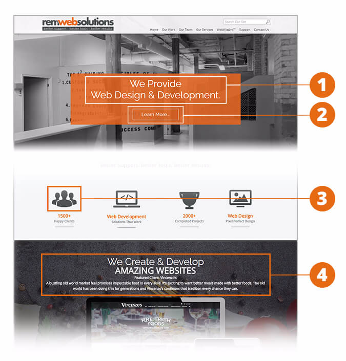
Again I’ll be using parts of REM’s homepage as an example with labels to illustrate the terms.

- Headline – This could also be known as “hero” text. Unlike a heading which could appear several times anywhere on a web page, the headline usually refers to the very first, large line of text that grabs the user’s attention and gives them a quick idea of your company. That means it could be your slogan, tagline or a quick summary of what you’re all about. REM’s headline at the top of the homepage is “We Provide Web Design & Development.” A headline is best when it’s short, concise and leaves an impression on the viewer. You can think of it as the “billboard copy” in your web page.
- Call-to-Action – The explanation is in the name. This is quite useful for marketing and advertising because it’s an element such as a graphic, heading, button, area, etc. that draws the user's eye and compels them to do something in your website. Its job is to make your user/customer do what you want them to do: contact you, go to this or that page, buy something, etc. For example, in our homepage the large “Learn More” button is a call-to-action to compel our customers to learn more about our services by contacting us.
- Iconography – This refers to illustrations, visual images or symbols that’re interpretations of an object or idea. Icons are used everywhere in our world, not just in websites. Unlike text which has to be a specific language, icons can be universally understood (think: the symbol for women’s/men’s washrooms). Also key aspects or ideas could be created into icons. In my example’s case, the illustration of a group of people conveys we have worked with many clients.
- Font – It refers to the typeface and style the texts uses. It plays a crucial role in establishing the website’s look and feel, particularly when it comes to making the design look consistent. Best practices suggest that one use no more than two or three font-styles. In the example I’ve highlighted there are two fonts being used: Raleway and Opens Sans (both sans serif).
Did you feel like you’ve learned something after reading my two-part blog post? I hope you have! We designers think in visual terms; we like to interpret the world around us with images not words, so you can imagine that it was a bit of a challenge for me to write down my personal definitions of these commonly used terminologies.
Just like last time, I shall end this blog post with another great quote to inspire you and/or make you think. This one is from Thomas Watson Jr., a businessman, political figure and 2nd President of IBM:
“Good design is good business.”


