Font-astic Terms
Continuing my theme of web design terms, this blog post is to further expand upon one of the main elements I’ve mentioned in my previous blog post: fonts.
As you might’ve read in my last blog post, it refers to the typeface the texts use. It plays a crucial role in establishing a website’s branding (look and feel), especially when it comes to composing a consistent and cohesive design. It can impact the message of the text itself. For example, using a hand-drawn style might give the viewer the impression that it’s a personal message from someone.
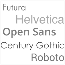
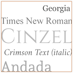
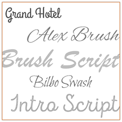
The following are my personal interpretations and are in no way the “official” meaning. There’re visual typeface examples on the right for each category mentioned. They can fall into these main “Font-astic Four” categories (Pardon the comic book pun! I couldn’t help it.):
Sans-serifclean and modern. This style is best used in all sorts of scenarios from headlines to small type to body copy because it’s easy to read, big or small. Common ones such as Arial and Helvetica are considered neutral styles. |
|
Serifclassic and traditional. This style is useful for business settings such as documents, formal letters and contracts, but still has so many variations that it could work in a modern context. Just like sans-serif it can be used in a large variety of things such as headlines, small type and/or body copy. |
|
Scriptcursive, elaborate and elegant, also known as “calligraphic” styles. This style always looks beautiful and unique; it definitely highlights text when used. However, unlike serif and sans-serif, it’s most effective when used sparingly, as most script typefaces are notoriously hard to read when small and will look busy when used too much. |
|
Hand-drawncustom-looking, fun and creative. It’s hard to give examples for this one because they’re not “standard” typefaces. It can also be combined with the other categories (as in a hand-drawn typeface can look like a script, sans-serif or serif typeface). This style is usually literally hand-drawn by the person who created it. Similar to script styles, they’re ideally used infrequently to highlight a headline or a callout. |
 |
There are plenty more categories typefaces can fall into, but these are the basic ones that come to my mind first. Just like any design element it’s not about the quantity, but the quality; that’s why best practices suggest that you only use 2 or 3 styles in a design. When used at the right spot in the right combination, they can give your users/customers the right feeling and attract them into the website, making them want to explore it further.
I shall end this blog post with another inspiring quote. This one is from Steve Jobs (I think almost everyone knows who is) one of the founders of Macintosh/Apple:
“Design is not just what it looks like and feels like. Design is how it works.”


