AODA – Colour Contrast and Headings

When designing your website, we enjoy being adventurous with our clients, especially when it comes to the colours you choose. Your website truly is your brand, an online reference to who you are and it’s extremely important that your design and colour scheme match who you are and what you stand for. When designing websites that need to be AODA compliant our designers and developers need to go the extra mile to ensure the colours you choose are both representative of you and fall within the compliance parameters of WCAG 2.0. This could be a tricky feat and here is why.
Colour Contrast
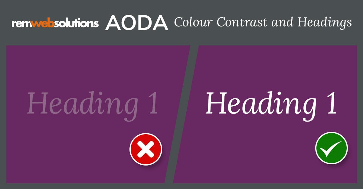
People with colour deficiencies and low vision may have difficulties viewing your website depending on the colours that you use. It is incredibly important that the contrast ratios comply with the requirements allowing people to receive information from your website visually. When choosing colours and fonts our designers and developers must following the following regulations:
Contrast– minimum ratio of 4.5:1
Bold & 14pt or 18pt + colour contrast ratio of 3:1
Add text labels to colour pickers
Use texture to complement colour information
Text on images should always use as high contrast as possible
Incidental/Decorative items such as logos are exempt
Colour Contrast Checkers: Web Aim Color Checker & CCA
Visual Hierarchy
Another very important aspect of AODA compliance is the ability to visually organize design elements in order of importance. This becomes mainly apparent when someone is using a device or screen reader to navigate content and information presented on a web page – typically this is done by tabbing on a specific type of keyboard.
In order for devices to navigate the content accordingly, headings must be strategically placed to allow a reader to comprehend the content, our designers and developers ensure the information is presented in an organized manner by making use of the correct Headings on a page:
Heading 1 – Only to be used once on a page
Heading 2 – Must be at least 1-point size smaller and follow an H1. Can have different styles
Heading 3 – Again must be smaller than H2. Is to be used as a subheading for H2 only
Heading 4 – must be smaller than H3. Is to be used as a subheading for H3 only and so on
When adding content to your website or designing the layout, it is extremely important to keep these regulations in mind. If you have any more question in regards to AODA compliance, or the information from this blog, please reach out to us!
Make your website AODA compliant! Visit aodawebsites.ca |


