The Psychology of Colour in Web Design
3 Tips to Use The Psychology of Colour for Your Marketing and Web Design
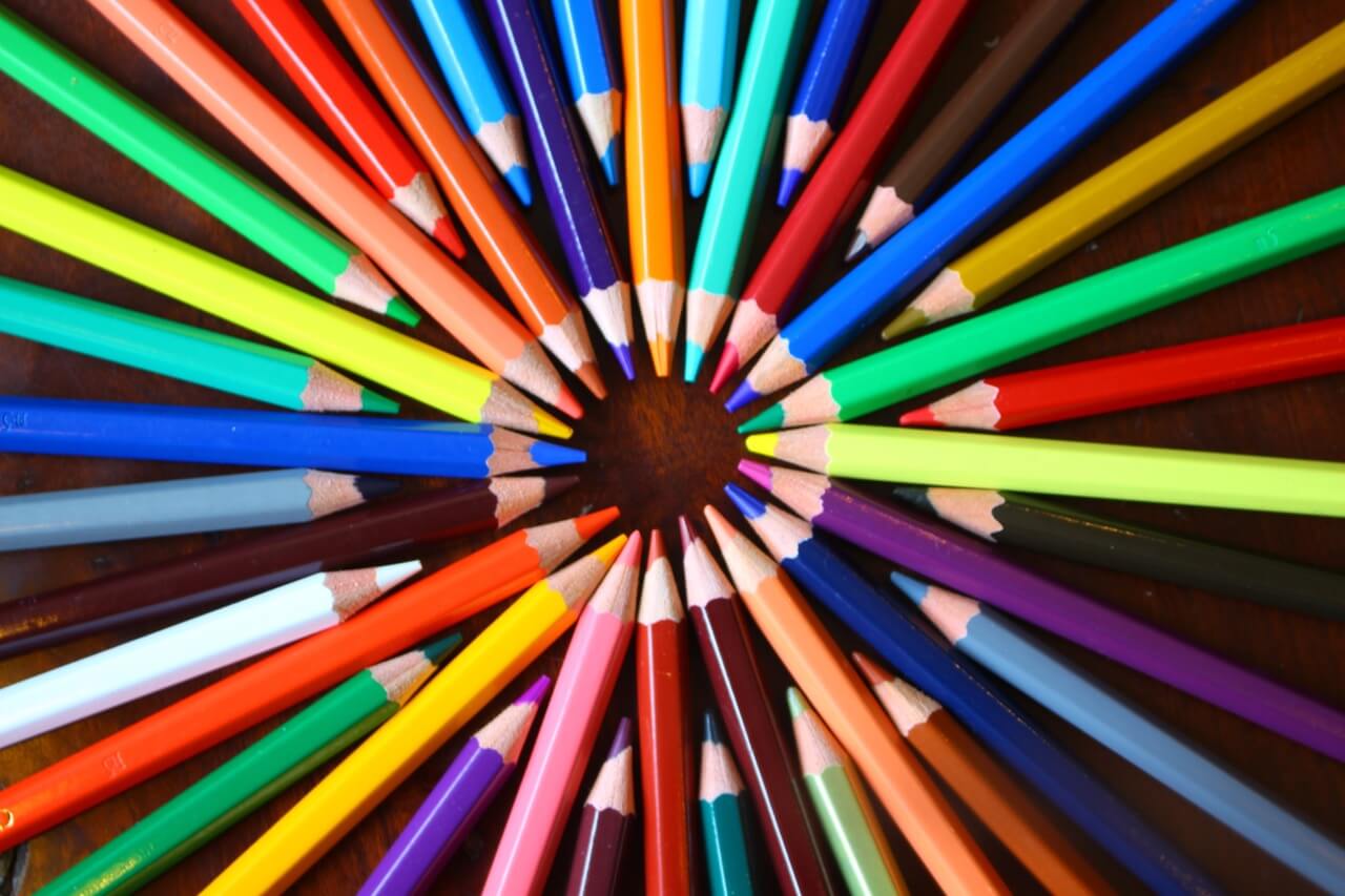
Colour is one of the first things that people notice when perceiving something new. As such, it's important that your marketing content and your website use colour in psychologically relevant ways to entice your customers into seriously considering your product. Here are 3 great ways to improve your web design by using colour.
Use specific colours according to your company needs
Use red to stimulate arousal. Using red has also been found to stimulate appetite, so if you're a restaurant or food based company, implement red throughout your menu and website.
Consumers tend to respond positively to the colour blue, as it's a calming and pleasing colour. It's a trustworthy colour, and men tend to prefer it. Try including blue in headers, or important areas on your website that you don't want your audience to miss.

Green is typically associated with health, movement, and growth. If you're a fitness-based or nature-oriented company, using green will help foster a connection with your customers.

Because purple is associated with royalty and luxury, it's often used to promote beauty products and other high-end goods. If you want customers to perceive your brand as extravagant, try including purple in your logo and headers on your website.

White is associated with tranquility and cleanliness, and is often associated with creativity because of its neutral appearance. Use white space for all your website's written content. Do this by separating your content into smaller sections, to make for easier reading.

Keep in mind that your web design should always use colours that your target market responds best to. Analyze and record data for any changes in colour you make to ensure you achieve the best results.
Consider your target market's age and gender
Women and young people tend to perceive colour better than men and older people. As a result, use colour more sparingly if men and/or older people are your main demographic. Keep in mind this doesn't mean you shouldn't use colour at all, instead try focusing on a few specific colours to engage your customers.
Having a strong association with a specific colour can help create a learned association between your brand and that specific colour
By having this strong connection, consumers will think about your brand whenever they see that specific colour. For example, consumers tend to associate a specific shade of blue with the luxury jewelry brand, Tiffany.
To create a similar pattern of thinking with your customers, make sure that you select specific brand colours to use throughout your website, marketing initiatives, and packaging design. This will help build a connection and will likely result in a learned association connecting your brand to your brand colours.

We always try and consider the psychology behind our Web Design and how it will interact with your target audience. If you want to be sure that all aspects of the design process are considered when building your website, contact us and let us take care of the process from start to finish.


