Colour is one of the most important visual elements to consider when designing your website. Each colour is associated with a different meaning and can elicit various feelings and memories depending on the person. However, most people make snap judgements about products based on colour alone, which is why so much consideration should be placed on the task of choosing the right palette.
Therefore, it’s necessary to seriously think about the colours you want to use when thinking about the look of your website, as they can have a direct influence on the people who engage with your business’ online presence.
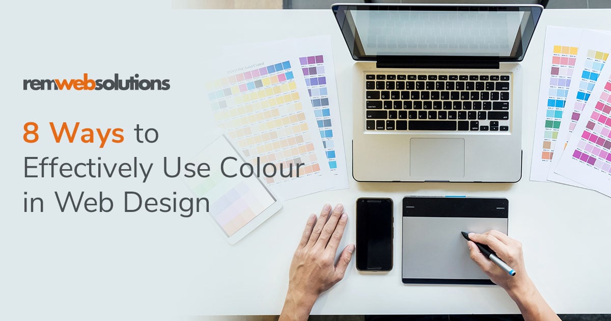
REM’s in-house designers and our marketing team are available to help discuss different colour options for your business website. In the meantime, check out the tips below for the most effective ways to use colour on your website and understand colour symbolism and connotations before you speak with them.
1. Warm colours
Warm colours are yellow, orange, and red. These colours are associated with energy, passion, positivity, enthusiasm, pleasure, and interest, to name a few. Be mindful of how you use these colours, as they can appear harsh and over-stimulating if they’re used too extensively.
2. Cool colours
Cool colours are blue, green, and purple. These colours have a calming effect on viewers, which is why they’re so commonly chosen for websites. Be wary about overusing them, as they can appear cold and impersonal if incorporated incorrectly.
3. Neutrals
Neutrals include white, black, grey, and brown and are popular choices for design. If used correctly, neutrals balance out more overpowering colours and can be incredibly elegant and chic.
4. Include an accent colour
When planning out the basic colour layout of your website, apply the very effective 60-30-10 ratio. When broken down, this means the main hue is applied to 60% of the website, the secondary is applied to 30%, and the remaining 10% applies to an accent colour that heavily contrasts the other two colours. The accent colour should be utilized as emphasis for the most important site materials and content.
5. Don’t go overboard
One of the worst things you can do is go overboard with your colour choices. Don’t feel the need to clutter your website with an overabundance of different colours, hues and tones. Less is more in this instance, and you don’t want to visually overwhelm the users on your site with too many conflicting and overlapping colours being used at once.
6. Think about your target audience
Really delve into your primary target audience, as this can help you narrow down your top colour choices. If your market is mainly women, studies have shown that they prefer blue, green, and purple. Men prefer blue, black, and, green. Blue seems to be a universally liked colour, so when in doubt, try to lean towards using blue. Lighter shades are typically associated with health and wellness, relaxation, and travel.
7. Consider the contrast of the background and text colours
Think about the colour of the background and the colour of the font you’re using and whether they will work well together visually. Colour combinations with enough contrast so the content is clearly visible and distinguishable on the page are important to consider for website visitors with visual impairments.
8. When in doubt, use a colour chooser tool
Colour scheme generators can be incredibly useful tools that can help you create a palette that’s professional and unique to your website. Play around with different colour wheels and try out various combinations to see what works best.
Conclusion:
Deciding on just the right colour scheme is so important for the efficacy of your website. Make sure you’re considering the symbolism and connotations of different colours, and you play around with combinations that are best suited for your target audience.
When you’re ready to go forward with an amazing business website design, contact your REM sales rep to get the process started.